UX Research · Case Study · 03
The Village Cares
Helping overwhelmed parents find, and trust, the right after-school programs, all in one place.
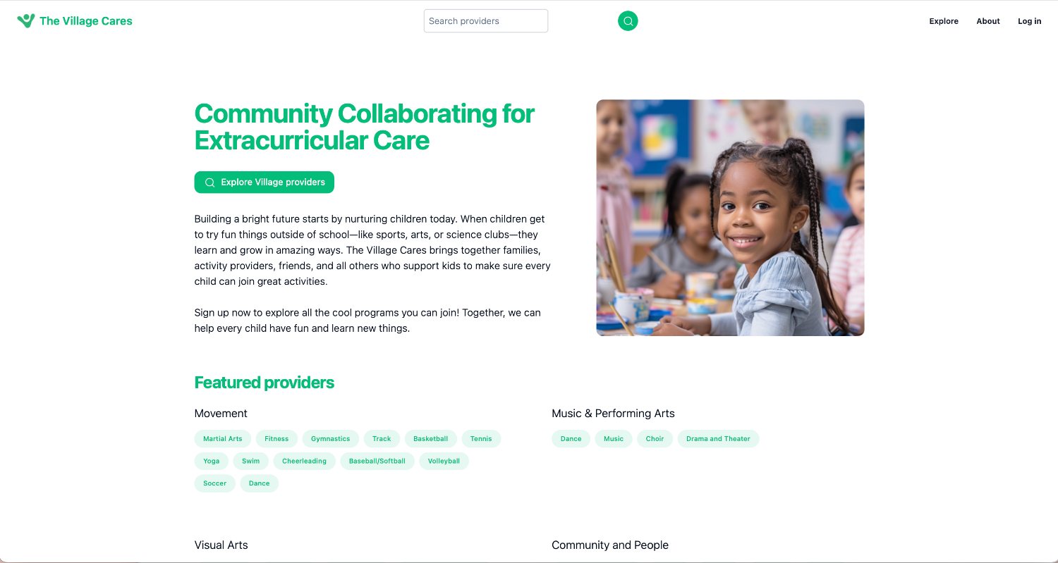
Helping overwhelmed parents find, and trust, the right after-school programs, all in one place.
Overview
The Village Cares is a platform that helps parents discover, evaluate, and enroll their children in high-quality after-school programs, centralizing information that's normally scattered across flyers, school emails, and dozens of separate websites.
Parents could search by location to find vetted programs nearby, compare options, and learn about providers through dedicated profiles. The long-term vision: a trusted ecosystem connecting families with educational, enrichment, recreational, and youth-development opportunities.
As the sole UX researcher I owned the research end-to-end, and served as the voice of parents throughout product development.
The Challenge
Parents struggle to find reliable information about after-school programs: it's spread across multiple sites, hard to compare, and short on the details that build trust. The search is time-consuming, and provider quality is hard to judge from the outside.
The product also aimed to give providers greater visibility while allowing them to control how their programs were represented. TVC set out to solve both, but first we had to prove the experience worked for parents.
My Role
I designed and executed the entire research process, and translated it into product direction the team could act on.
The founding team set product direction and built the site I tested. I was the research function; every plan, script, persona, synthesis, and recommendation below is mine.
What I owned
moderated parent usability sessions conducted
scenario-based tasks per session, ~30–45 min each
findings synthesized across the three sessions
prioritized recommendations delivered to the team
Phase 1 · Approach
Goal: evaluate how intuitive, usable, and clear the TVC website is, understanding parent behavior, perceptions, and feature clarity through moderated, scenario-based testing.
A live site already existed, so the open question wasn't what parents wanted in the abstract, it was where the current experience broke down. Scenario-based tasks let me watch parents attempt real goals rather than ask them to predict their own behavior, and the moderated format let me follow the confusion in the moment.
Scenario-based tasks covering homepage impressions, provider search, sign-up, the About page, and the fundraising feature.
Moderated, remote sessions (~30–45 min), aligned with our primary parent persona.
Output: task-by-task feedback, thematic insights, and recommendations, all centralized in a shared repository.
An honest constraint
I aimed to recruit five parents but moved forward with three because parent availability made the criteria difficult to fill. Rather than stall, I ran a focused study with three rich sessions and carried recruiting momentum into Phase 2.
Who I tested with
30s · Queens · two toddlers
30s · Jersey City · one toddler
41 · Queens & CT · three kids (teens + toddler)
Synthesis · Personas I built
I built three personas spanning both sides of the marketplace, the parent making the decision, and the providers who need to be found. They differ in how much evidence sits behind them, and I labeled them that way for the team. The guardian persona is grounded in the three parent sessions; the two provider profiles are proto-personas, informed by the parent research, secondary research, and early ecosystem assumptions. No providers were interviewed during this phase.
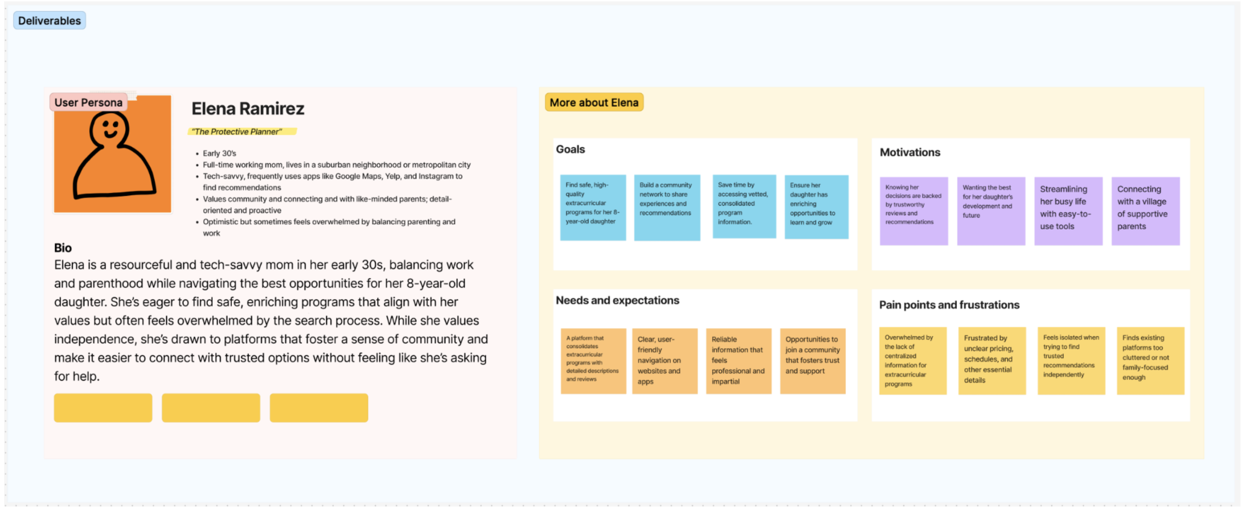
The Protective Planner
Guardian · primary persona
“I want the best for my daughter, without the search taking over my life.”
Bio
Resourceful, tech-savvy mom in her early 30s, balancing work and parenthood for her 8-year-old. Uses Maps, Yelp & Instagram for recommendations.
Goals
Find safe, high-quality programs; build a community of parents; save time with vetted, consolidated info.
Pain points
Overwhelmed by scattered info; frustrated by unclear pricing & schedules; existing platforms feel cluttered, not family-focused.
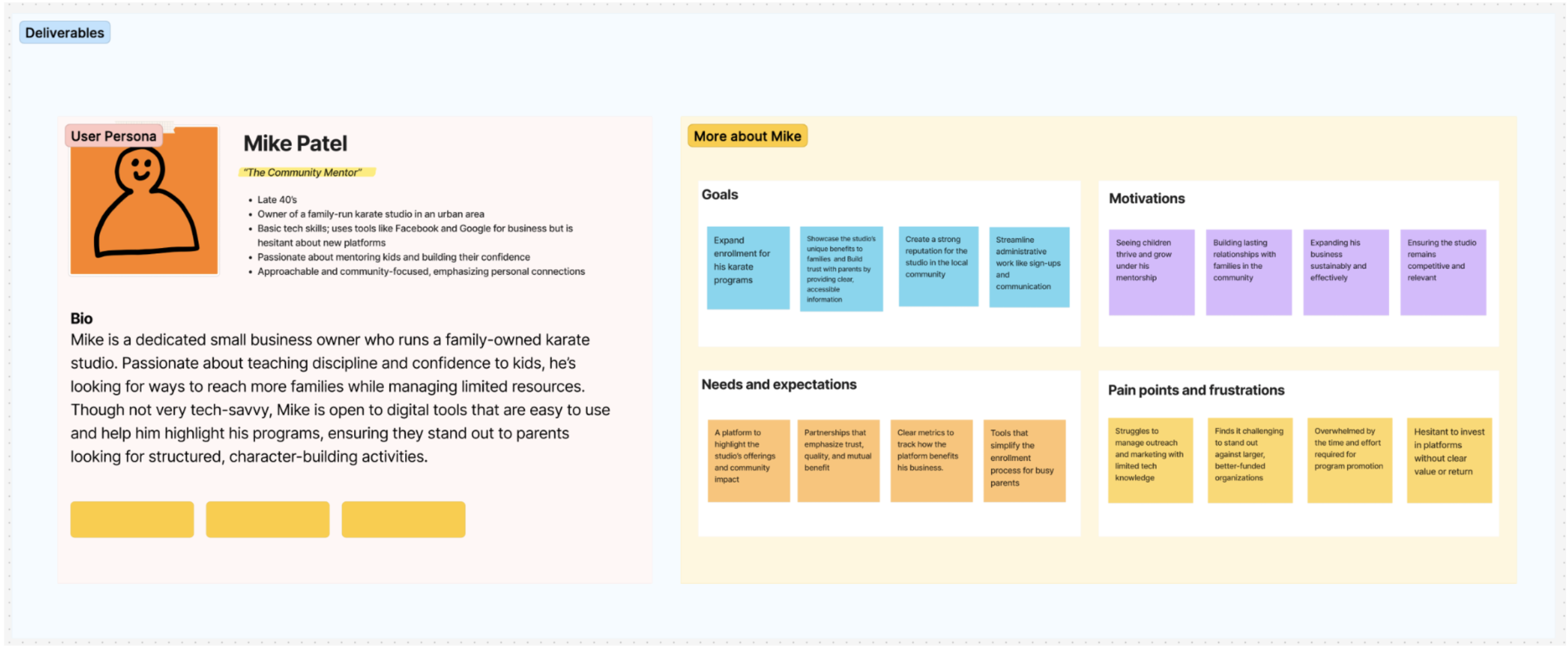
The Community Mentor
Small provider · secondary
“I just want more families to find us.”
Bio
Late-40s owner of a family-run karate studio. Basic tech skills; passionate about mentoring kids; open to easy-to-use tools.
Goals
Expand enrollment, showcase the studio's value, build trust with parents, and simplify sign-ups.
Pain points
Hard to market with limited tech; tough to stand out against bigger orgs; wary of platforms without clear ROI.
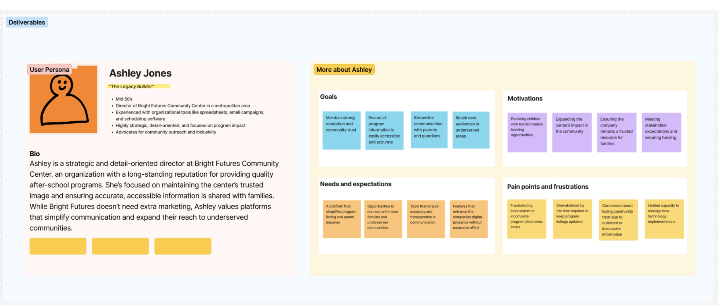
The Legacy Builder
Established provider · secondary
“Our reputation depends on accurate, accessible information.”
Bio
Mid-50s director of an established community center. Strategic, detail-oriented; advocates for outreach and inclusivity.
Goals
Maintain trust, keep info accurate, reach underserved areas, and streamline parent communication.
Pain points
Inconsistent online directories; time to keep listings current; limited capacity for new tech.
Synthesis · Findings
Parents loved the mission, but the experience left them unsure what TVC was, and short on the details that drive a real enrollment decision. I carried each observation through to a recommendation, marking whether the fix came from parents directly or from reading across the sessions.
On the homepage, parents were unsure whether TVC was a provider, a platform, or a connector. That uncertainty shaped their whole first impression.
Interpretation
A warm tone can't do the work of a value proposition. Parents were deciding whether to trust something they couldn't categorize.
Recommendation
Add a short homepage tagline naming the platform's role, e.g. “Your trusted guide to local extracurricular programs.”
Parents looked for age ranges, class times, price indicators, and reviews, and mostly didn't find them.
Interpretation
Discovery isn't the hard part of the parent journey, evaluation is. A listing that can't be compared can't be chosen.
Recommendation
Add consistent age range, program type, price range ($/$$/$$$), and parent reviews to every provider page.
Parents wanted to filter by age group, proximity, and cost. None existed.
Interpretation
TVC promised to save parents time, but without filters it reproduced the scattered search it set out to replace.
Recommendation
Build filtering by age, location, and cost into search.
They asked to save providers by activity or by child, described as “little Pinterest boards,” so they could revisit and compare.
Interpretation
Choosing a program is a decision made over weeks, across multiple children. The product treated it as a single session.
Recommendation
Let parents save providers and organize them by activity or by child.
The signal that changed everything
Parents were enthusiastic about an optional fundraising feature, framed around birthdays, holidays, and milestones, that makes it easy to ask for support without pressure. It made parents feel celebrated, not ashamed.
All three parents described the platform as welcoming, inclusive, and community-focused, supportive rather than sales-driven.
Interpretation
The emotional positioning was already right. Whatever else changed, this was the asset to protect.
Recommendation
Preserve the tone in any redesign, and lead with it rather than leaving it on the About page.
No welcome email, no personalization, no stated benefit, parents didn't know what an account was for.
Interpretation
Registration asked for commitment before delivering value, the reverse of how parents evaluate anything for their kids.
Recommendation
Add a welcome email and post-sign-up personalization (child's age, interests, zip) so the payoff is immediate.
Moving between pins, the provider list, and a program page was unclear; parents lost their place mid-search.
Interpretation
Losing your place is expensive when you're comparing, parents restarted rather than continuing.
Recommendation
Make the path from pin → list → program page explicit and reversible.
Parents called it clean but clinical, and asked for more imagery, warmth, and color to signal a platform for families.
Interpretation
The copy said community; the design said directory. That mismatch undercut the trust the mission had earned.
Recommendation
Add photography, color, and family imagery so the visual language matches the mission.
Task-level usability evidence
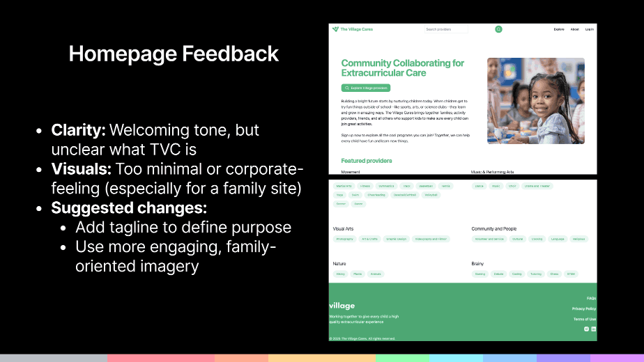
Homepage welcoming tone, but parents couldn't tell what TVC is. I recommended a defining tagline and family-oriented imagery.
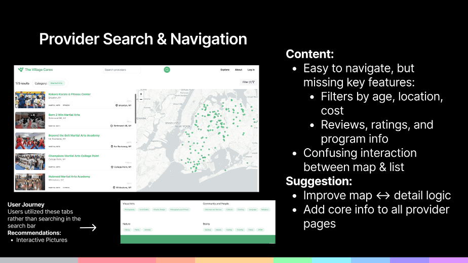
Provider search & navigation easy to move around, but no filters, and the map and list didn't connect.
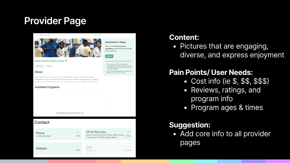
Provider page cost, reviews, ages, and times were missing from the information parents needed to decide.
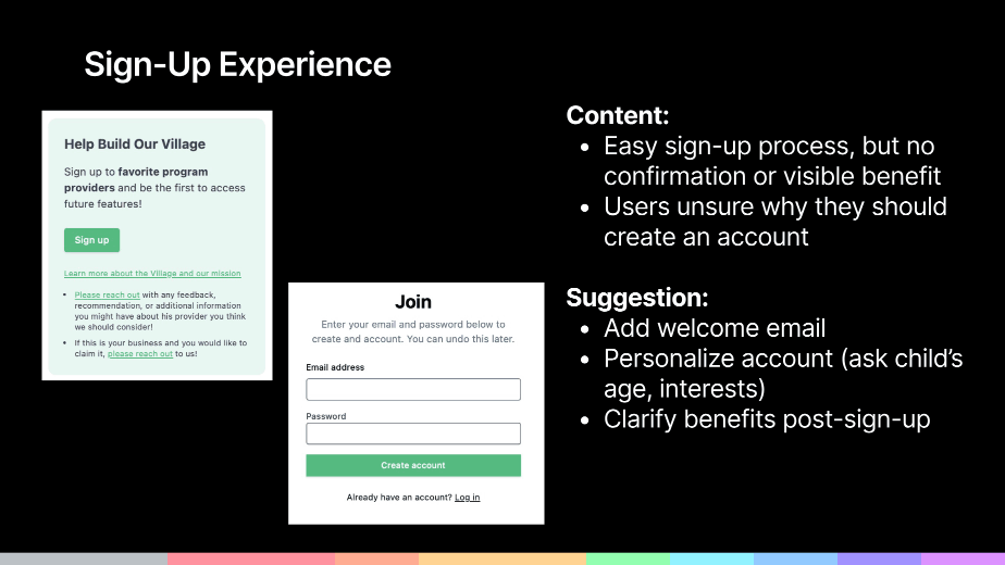
Sign-up easy to complete, but with no visible benefit. I recommended a welcome email and personalization.
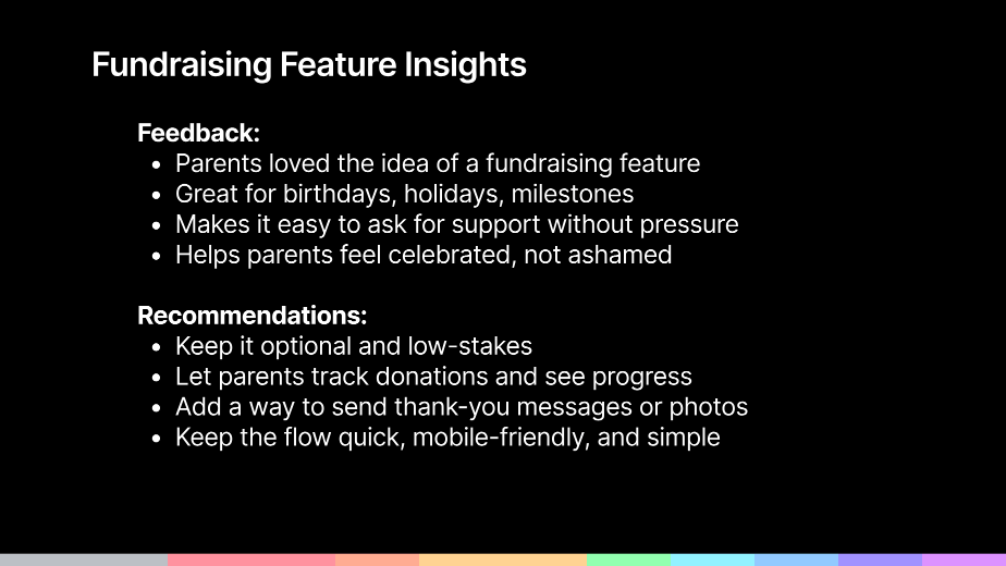
Fundraising feature the parent response that pointed to affordability, and the recommendations that followed.
In parents' words
“This feels like a resource, not a sales pitch—the tone is really supportive.”
User 3
“I'd love to save programs by interest or by child, like little Pinterest boards.”
User 3
“I would totally use the fundraising if it was for a birthday instead of asking people for toys.”
User 1
“The homepage didn't really grab me, it needs more pictures or color to feel like it's for families.”
User 2
Recommendations & handoff
I tiered the eight recommendations so the team could sequence them, and centralized every finding, task observation, and recommendation in a shared research repository they could keep working from.
Blocking a decision
Clarify what TVC is with a homepage tagline
Enrich provider profiles: age, type, price range, reviews
Build filtering by age, location & cost
Building the habit
Strengthen sign-up with a welcome email & personalization
Enable save & organize by activity or child
Connect map, list & detail views
Strategic
Explore optional fundraising tied to birthdays & milestones
Warm up the visual tone with family imagery & color
Outcomes, limitations & next steps
Research output
Research influence
Not measured
Three parents is a small, non-representative sample, enough to surface consistent friction, not enough to size or rank it. All three were parents; no providers were interviewed in this phase, so both provider profiles remain proto-personas rather than validated research personas. Findings reflect first-encounter reactions in a moderated setting, not behavior across a real enrollment season.
Complete recruiting to five or more parents and retest search and provider pages against the new filters and profile fields, measured against this baseline. Interview providers directly to replace the proto-personas with evidence. And test the fundraising concept properly rather than inferring demand from enthusiasm, which is exactly what Phase 2 became.
Reflection & what's next
Phase 1 set up the next two user types, providers (after-school & enrichment orgs) and funders (community donors and family members). But the loudest signal was about money: parents lit up at the idea of community fundraising because affordability was a real barrier to enrollment.
That insight didn't just refine TVC—it reshaped it. The product evolved into SUMMA, a community-powered way to fund kids' access to programs.
See how it became SUMMAWhen recruiting fell short of five, I ran a focused study with three rather than waiting indefinitely, and still surfaced clear, actionable patterns.
As the only researcher, I made sure every product conversation came back to what parents actually said, not assumptions.
The fundraising feature was one component of testing, but participants' emotional response revealed a larger unmet need. Staying curious about why the concept resonated changed the product's direction.