UX Research · Case Study · 02
SUMMA
Turning a program-discovery platform into a community-powered way to fund kids' access to the activities they love.
Turning a program-discovery platform into a community-powered way to fund kids' access to the activities they love.
The pivot
The Village Cares began as a way for parents to discover and access vetted after-school programs. But through research, one barrier rose above the rest: affordability was the biggest thing keeping kids out of extracurriculars.
So the product evolved into SUMMA a platform that not only helps families discover opportunities, but helps them raise funds through their own communities to pay for participation.
The challenge became: How might we help families discover opportunities while giving them a trusted way to fund those opportunities through their communities?
See where it started: The Village Cares View SUMMA's current website ↗My Role
As the only researcher, I owned SUMMA's research from concept validation through provider discovery: planning, moderating, synthesizing, and presenting findings to the founders. I recruited the parent and donor participants through referrals within my personal and professional networks; the founders recruited the four service providers through their existing business relationships.
The founders set product direction and built the prototype I tested. I was contracted for the research, and my scope ended at recommendations and handoff.
What I owned
Two phases
Would parents and donors understand the SUMMA concept, use the tools, share campaigns, donate, and trust the platform? Concept and usability testing, because the product idea and the interface were both unproven.
How do service providers operate, what are they comfortable sharing, and how do they perceive discoverability and partnership? Exploratory and semi-structured, because the goal was to surface constraints, not evaluate a design.
parents, ages 31–50, in concept & usability testing
prospective donors, ages 31–50, tested the giving side
service providers interviewed 1:1 in Phase 3
audiences researched, parents, donors & providers
Phase 2 · Fundraising concept validation
I tested the concept and the interface with five parents/caregivers creating funds and five prospective donors, men and women ages 31–50, all recruited through referrals in my personal and professional networks. Donors were people who could realistically contribute to a charitable or community-support fund. This grounded the giving-side feedback in plausible donor perspectives, although willingness to donate remained self-reported.
Each participant walked through the end-to-end fundraising experience in a moderated UX interview of roughly 30–40 minutes, from setting up a fund to making a donation, reacting to wireframes, flows, and messaging.
Five flows were tested: how SUMMA works, setting up a fund, fund updates, sharing, and donating. Most participants got the purpose right away, and several parents said they'd use it immediately.
Fundraising experience tested with fund creators and donors
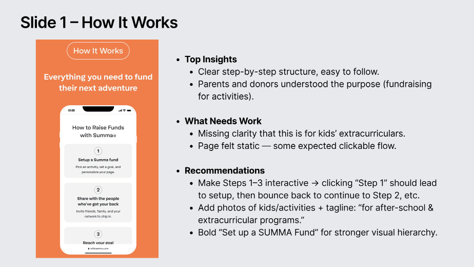
How it works did the concept land on first read, and what made it feel trustworthy.
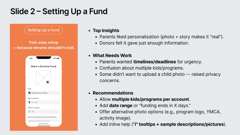
Setting up a fund where parents wanted examples, presets, and inline guidance.
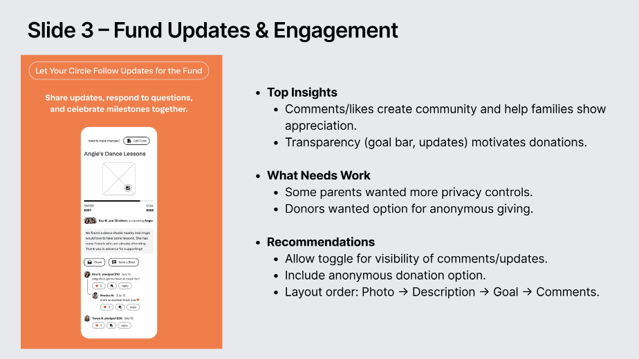
Fund updates & engagement community features, and the privacy controls both sides asked for.
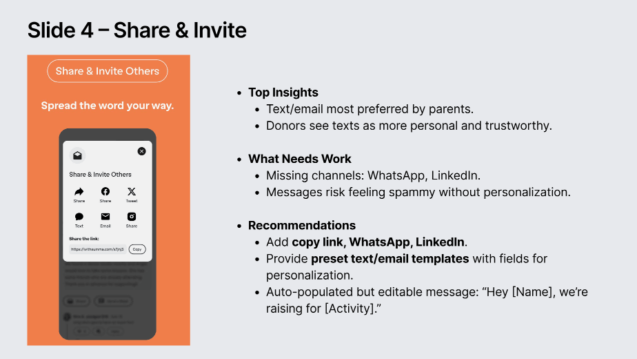
Share & invite why a generic link read as spam, and which channels were missing.
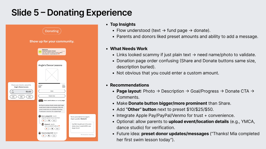
Donating payment friction, page order, and what made a donor actually give.
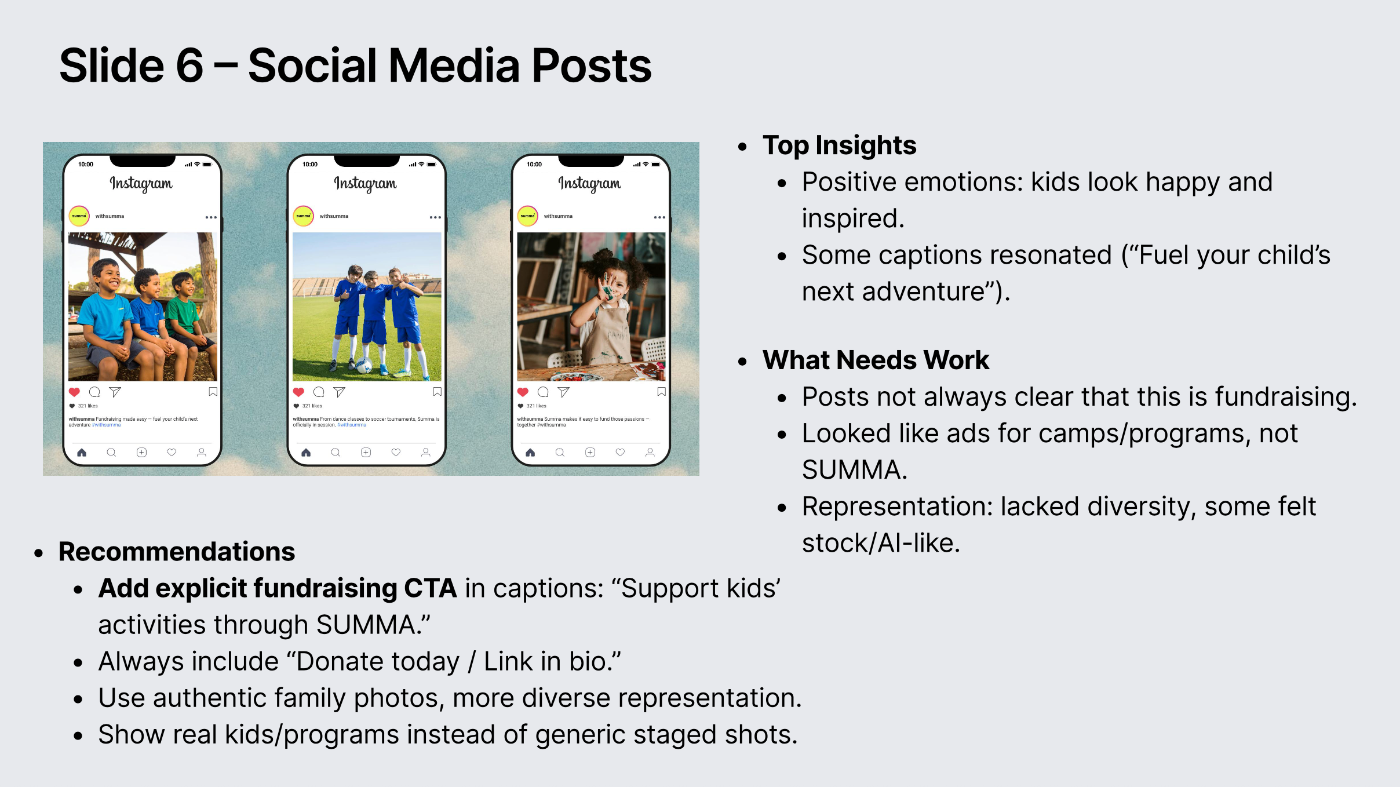
Social media posts why the posts read as program ads instead of fundraising.
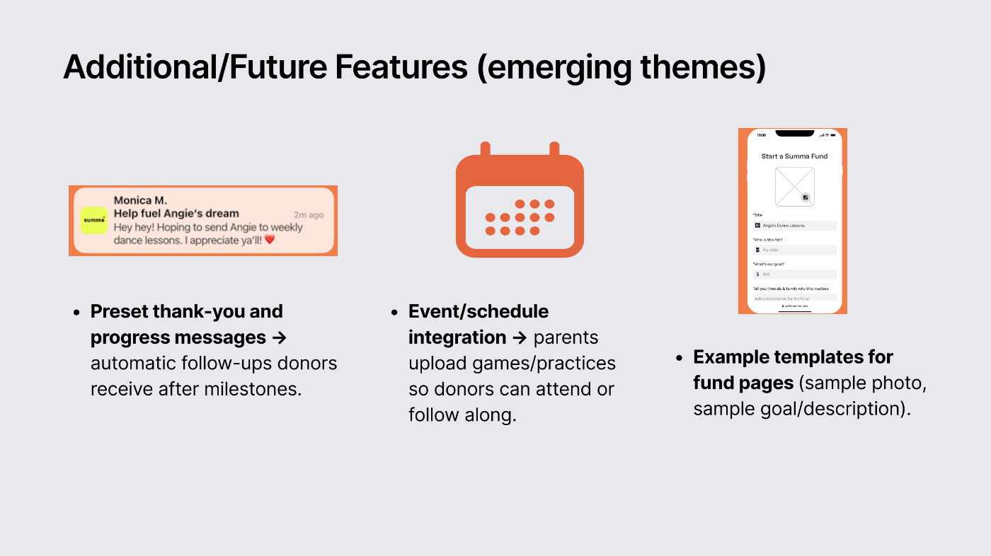
Emerging feature themes preset thank-yous, schedule integration, and example fund templates.
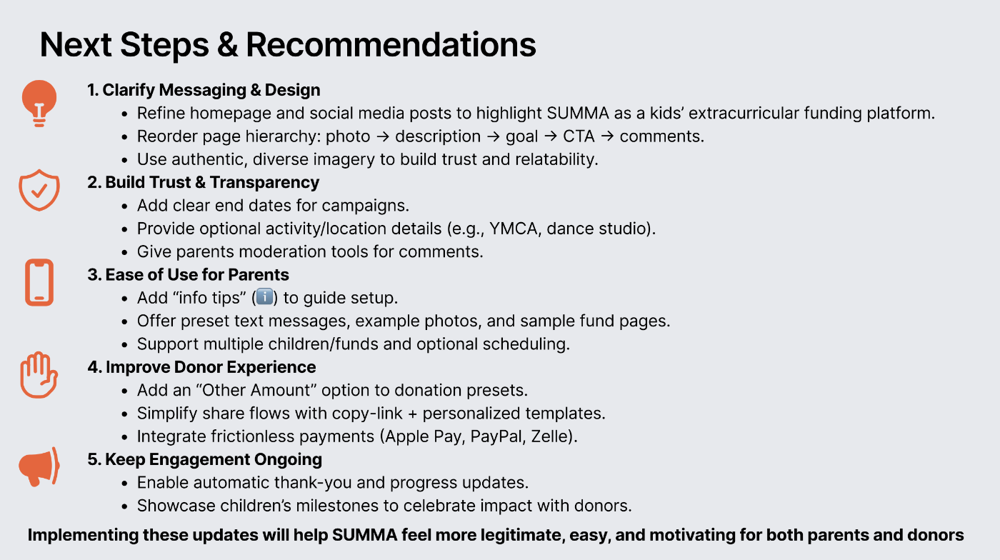
Recommendations five areas: messaging, trust, ease of use, donor experience, and ongoing engagement.
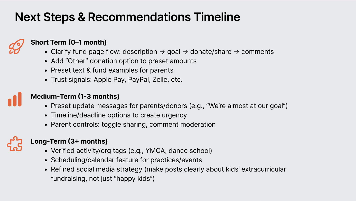
Recommendations timeline short-, medium-, and long-term priorities handed to the founders.
Phase 2 · Findings
I clustered observations across both groups into themes, then carried each through to a recommendation. Where a fix came directly from participants it's marked as theirs; where it came from reading across sessions, it's marked as synthesis.
Several parents described discomfort asking their network for money, even for their own child's activity.
Interpretation
The barrier wasn't the tool, it was the framing. “Fund their next adventure” worked because it read as investment, not need.
Recommendation
Carry that reframe through every screen and share message: kids, activities, opportunity, not hardship.
Donors consistently expected Apple Pay, PayPal, or Venmo and resisted entering card details.
Interpretation
The single highest-friction moment in the whole flow sat at the point of conversion.
Recommendation
Integrate quick-payment options before launch, and make the Donate CTA visually dominant over Share.
A link only felt safe when it was personalized and clearly tied to someone the recipient knew.
Interpretation
Generic SUMMA-branded copy read as spam. Trust travels through the sender, not the platform.
Recommendation
Auto-generate share messages that carry the sender's name and a personal note, easily editable.
Setup steps felt simple, but parents asked for sample photos, sample fund pages, preset messages, and small info icons per field.
Interpretation
The friction wasn't the form, it was writing a compelling ask. Most parents don't want to author fundraising copy.
Recommendation
Build guided fund creation with examples, presets, and inline help.
Parents valued comments for gratitude but worried about inappropriate ones they couldn't remove; some donors wanted to give anonymously.
Interpretation
Transparency and privacy pulled in opposite directions, and the design had to serve both rather than pick one.
Recommendation
Add donor anonymity, parent-side moderation, and private-vs-public visibility settings.
Participants described the sequence they looked for: photo → description → goal → donate → comments. The tested layout didn't match.
Interpretation
A mismatch between expected and actual hierarchy made an otherwise-understood page feel confusing.
Recommendation
Reorder the fund page to the sequence participants described.
Parents with multiple children wanted to create more than one fund, and to control what each one shares publicly.
Interpretation
The single-fund model didn't match household reality, and privacy preferences varied by child.
Recommendation
Support multiple funds per family with per-fund visibility settings.
Neither group saw timelines. Donors said end dates would prompt them to act.
Interpretation
Progress bars created interest; deadlines were what converted interest into a decision.
Recommendation
Display campaign end dates and time remaining alongside goal progress.
Social posts looked credible but didn't clearly communicate fundraising for kids' activities.
Interpretation
Comprehension held inside the product and broke outside it, where first contact actually happens.
Recommendation
Revise marketing assets so every visual ties explicitly to funding kids' activities.
WhatsApp and LinkedIn were requested multiple times; parents preferred direct, personal sharing over broadcast.
Interpretation
Sharing follows existing relationship channels, not the platform's preferred ones.
Recommendation
Expand share options to include WhatsApp and LinkedIn.
Photos, child and program details, and the organization's name were what donors cited as reassuring.
Interpretation
Legitimacy was assembled from specifics, a generic page couldn't earn it.
Recommendation
Surface program name, location, provider info, and verification indicators on every fund page.
Parents wanted milestones and to show how funds helped their child; donors valued transparency even when they didn't comment.
Interpretation
Updates served two different jobs: gratitude for parents, accountability for donors.
Recommendation
Automate thank-yous, milestone updates, reminders, and success stories.
Phase 2 · Recommendations
I tiered the recommendations so the founders could sequence them: what to fix before launch, what to build next, and what needed a structural decision rather than a design change.
Immediate
Make the Donate CTA dominant over Share
Reorder the fund page: photo → story → goal → progress → donate → comments
Add an “Other amount” option beside preset tiers
Add campaign deadlines and time remaining
Personalize share messages with the sender's name
Next
Guided fund creation: examples, presets, inline info icons
Automated thank-yous, milestone updates & reminders
Multiple funds per family
Expand sharing to WhatsApp and LinkedIn
Revise marketing assets to tie visuals to funding kids' activities
Structural
Quick-payment integrations (Apple Pay, PayPal, Venmo)
A privacy model: donor anonymity, moderation, per-fund visibility
Verification and provider credibility on fund pages
Program data: names, locations, photos, reviews
Phase 3 · Provider discovery
SUMMA is parent-first, but parents need to discover real programs and know where funds go. So I ran a light-touch exploratory study with four service providers to understand how they operate, what they'll share, and what makes a partnership feel worthwhile. The founders recruited the participating businesses through their existing relationships.
Moderated 1:1 UX interviews · 30–40 min · 21 open-ended questions across 7 sections · n = 4. This was exploratory discovery, not an evaluation of tools, features, or workflows.
The four represented distinct operating models, which surfaced constraints rather than just preferences. All served families with affordability considerations, all relied on trust, word-of-mouth, or school relationships, and all already managed multiple tools or systems.
Martial arts and enrichment with school pick-ups, logistics-heavy operations.
In a growth phase, focused on marketing reach and new enrollment.
Already using multiple platforms, the most platform-savvy of the four.
Structured, center-based operations, quality-protective and mission-aligned on access.
Open to
Being discoverable on a platform parents trust
Sharing program descriptions, mission, schedules & photos
Cautious about
Static or public pricing, discounts & competition make it sensitive
Anything that adds operational work or another platform to manage
Phase 3 · Top insights
Openness to partnership is real, but conditional: SUMMA must feel lighter than their existing tools, never additive.
Variable discounts, enrollment windows, and competition make rigid public pricing a barrier to adoption.
“Right families” beats “more families”, school-level targeting helps logistics, trust, and retention.
Visibility alone isn't compelling, value is tied to inquiries, enrollment, and proof of impact.
Providers want reliability, clear scope, and respect for their existing systems. Trust is built by avoiding overreach early.
Pricing, scheduling, staffing, and even the definition of “success” varied widely, rigid standardization would exclude a meaningful share of providers.
Provider UX interview script · excerpt
01Warm-up & context
03Partnership & value
05Trust & relationship building
Provider discovery: selected research evidence
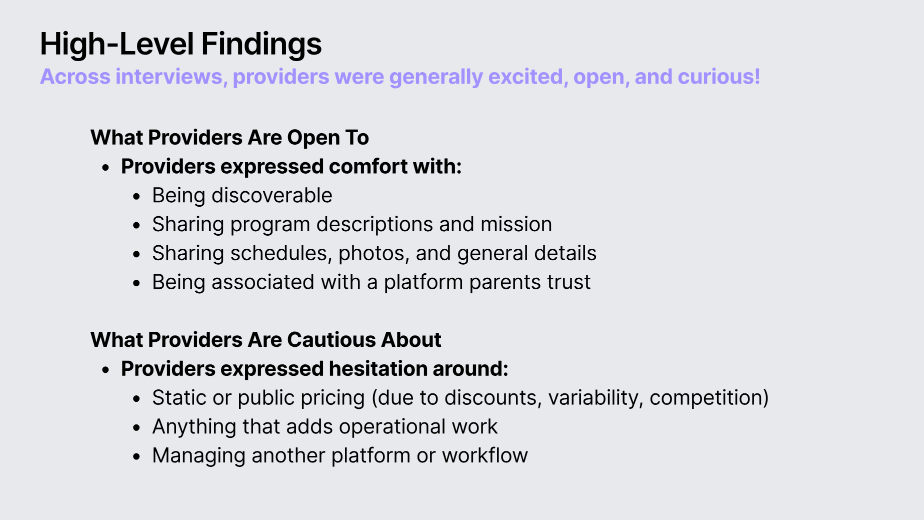
What I learned what providers were open to, and what they were cautious about.
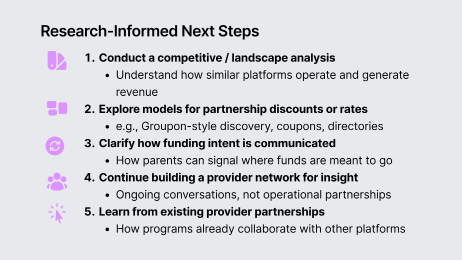
What the research changed the next steps I recommended to the founders.
Key takeaway
Providers are open to partnership, but conditionally: openness is not the same as willingness to adopt new workflows. That reinforced SUMMA's parent-first approach: keep provider involvement light and focus on the central barrier—funding.
Outcomes, limitations & next steps
I was contracted for the research, and my engagement ended with recommendations and handoff. I delivered concept and usability insights across three audiences, synthesized the needs of parents, donors, and providers, and handed the founders prioritized recommendations to support subsequent product decisions.
I have no verified evidence of what was implemented after that. Nothing here should be read as shipped features, improved metrics, or measured business outcomes.
Research output
Intended influence
Not measured
Five parents, five prospective donors, and four providers constituted small, non-representative samples recruited largely through existing networks. This may have increased comprehension and goodwill. Donor intent was self-reported rather than observed through actual giving, and the exploratory provider sample was sufficient to identify constraints but not to generalize across provider types.
Competitive / landscape analysis how similar platforms operate and generate revenue.
Partnership models discovery, coupons, or directory approaches worth testing.
Clarify funding intent how parents signal where donated funds are meant to go.
Test with recruited-outside-network participants to check whether comprehension holds.
The affordability insight from The Village Cares didn't just refine a feature, it reshaped the whole product into SUMMA. That's research at its highest leverage.
Provider work was intentionally light-touch, enough to ground the parent experience without over-building for a non-primary user.
Studying people seeking support, people funding it, and businesses providing it meant the recommendations had to hold up from all three sides, not just the one paying attention.
I'd recruit at least part of the sample outside my own networks. Referral recruiting got me depth quickly, but it's the limitation I'd have to caveat in every readout.