UX Research · Case Study
Baddies in Tech
Researching a more intuitive, more welcoming home for a community built to grow women of color in tech.
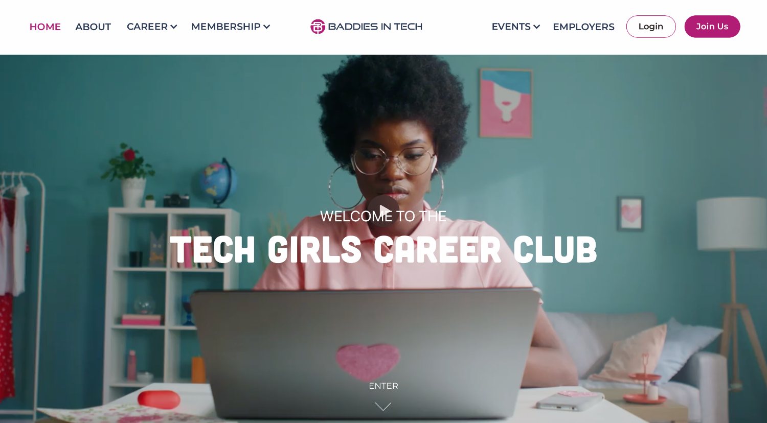
Researching a more intuitive, more welcoming home for a community built to grow women of color in tech.
Overview
Baddies in Tech (BIT) is a nonprofit founded in 2019 by three Black women on a mission to help women of color transition into and grow within the tech industry, through resources, opportunities, networks, and a genuinely safe community.
Their vision is ambitious: to double the representation of Black, Latina, and Native American women in tech to 10% by 2030. But the website meant to welcome new members and guide them toward joining was creating friction: visitors struggled to understand what BIT offered, find membership benefits, or locate scholarships and resources.
My research team was brought in to figure out why, and to give the design and writing teams the evidence they needed to fix it.
The Challenge
The current site made it difficult for visitors to understand the value of membership and complete key membership actions. Three problems sat underneath that:
New-member onboarding. Visitors weren't becoming members, slowing community growth.
Partnership & sponsorship leads. Design and functionality gaps risked weakening partnership and sponsorship lead generation.
Resource & opportunity access. Members couldn't find the very programs BIT existed to offer.
My Focus
I worked across the full research arc, from auditing the existing experience to running the usability study that benchmarked it and synthesizing findings the team could act on.
What I owned & contributed to
member survey responses analyzed across 2022 & 2023
target-audience participants recruited through BIT's community
moderated sessions completed & synthesized
critical issues prioritized to steer the redesign
The Process
Got to know the org and its members, analyzed existing survey data, audited the live site against usability heuristics, and helped map user flows and journeys.
Built the usability research plan, wrote the tasks and follow-up questions, and recruited most of the participant pool from BIT's community.
Moderated remote sessions benchmarking the current experience, capturing where members got stuck and what they wished existed.
Centralized the data, built the affinity map, and prioritized each issue based on severity and frequency.
Ran a card sort to settle navigation debates and rebuild the information architecture around how members actually think.
Handed the design and writing teams a ranked set of recommendations, and a benchmark to measure the redesign against.
Discovery · Understanding the member
Before touching the interface, I dug into the survey data BIT had already collected, analyzing responses from their 2022 and 2023 member surveys to understand the community's makeup, their biggest needs, and where the current experience was falling short.
One pattern was loud and consistent: members wanted more across a wide range of support, with the top four requests clustered tightly between 16% and 17% of responses, no single need dominating.
want guidance on breaking into tech
want more job opportunities
want coaching & mentoring from experts
want an in-person conference for WOC in tech
The takeaway I brought to the team
Members want more experiences, mentoring, job opportunities, monthly workshops, coaching, affordable training, and resume & interview help. As the community grew, so did the expectation that support reach members anywhere, not just in the U.S.
Member survey, 549 responses (2022–23)
Members weren't asking for one isolated feature. They wanted a clearer, more accessible ecosystem of opportunities, mentoring, learning, and community.
Discovery · Heuristic evaluation
Building on my teammates' early research, I evaluated the live site against Nielsen's usability heuristics, and identified usability issues spanning nearly all 10 heuristics.
Visibility of system status. The membership sign-up never showed members which step they were on.
Error prevention. Form error messages failed to specify what had actually gone wrong.
Match to the real world. Jargon and unlabeled options left users guessing.
This was the signal that we needed deeper evaluative research, a usability study, to see these problems through members' eyes.
Discovery evidence
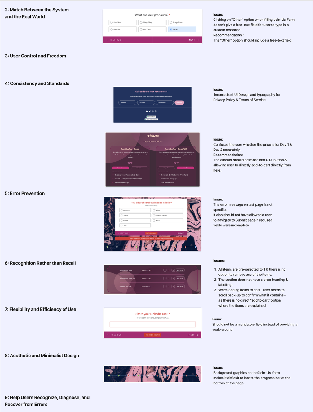
Heuristic evaluation annotated issues across the live site, organized by heuristic. I conducted it, building on teammates' early research.
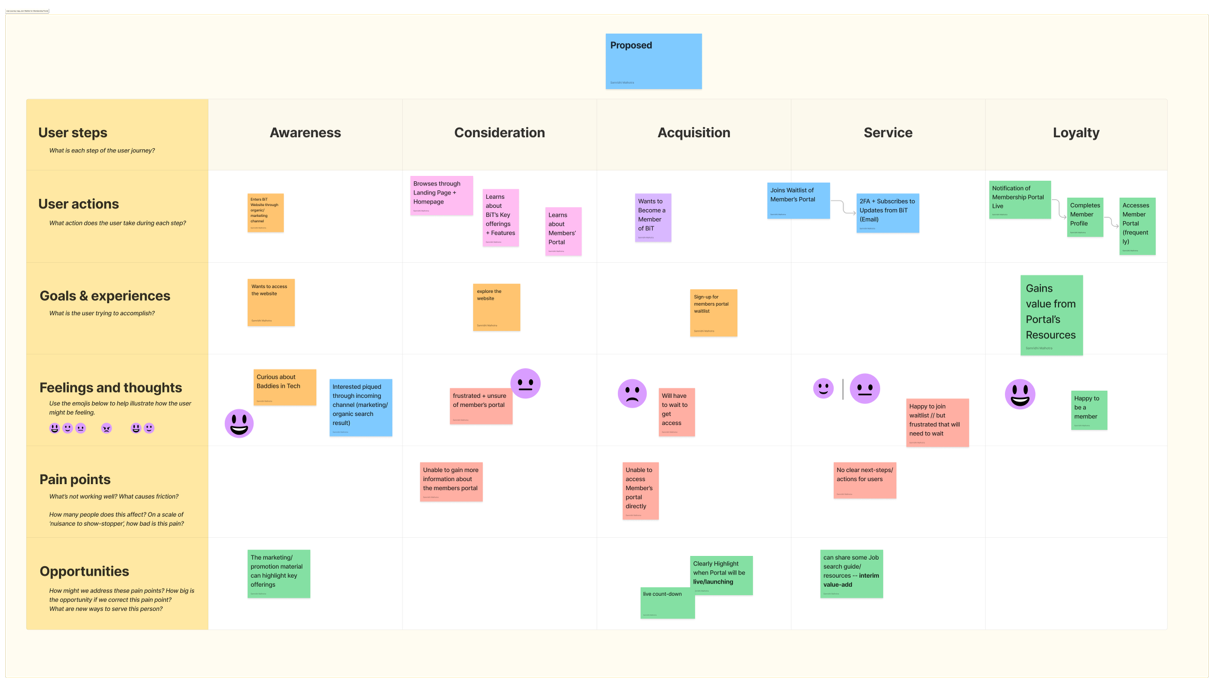
User journey map the proposed sign-up journey, from awareness to loyalty. Created by a teammate; I contributed to journey mapping.

Member-portal survey, 20 responses 85% had portal access elsewhere, half via LinkedIn. Led by another research lead; it informed the design team's portal decisions.
Discovery · Supporting research
Discovery was a team effort. I contributed to user flows and journey mapping and to the wireframe evaluation; other researchers led the competitor SWOT and the member-portal survey. Together they framed what we'd put in front of users.
The core · Usability testing
I led the usability research plan end to end: writing the goals, tasks, and follow-up questions, and recruiting most of the participant pool through BIT's Discord community so testers genuinely reflected the target audience. We recruited six target-audience participants and completed and synthesized four moderated sessions.
Participants joined remote, moderated sessions over Zoom. I invited the design, writing, and strategy teams to shadow, cameras off and mics muted, so they could hear members in their own words without making anyone feel watched.
The five questions we set out to answer
What are users' first thoughts and feelings on the overall design?
Is the homepage / About messaging clear about BIT's mission?
Is the website navigation intuitive?
Can users register for an event?
Can users sign up for the membership waiting list?
Testing & synthesis
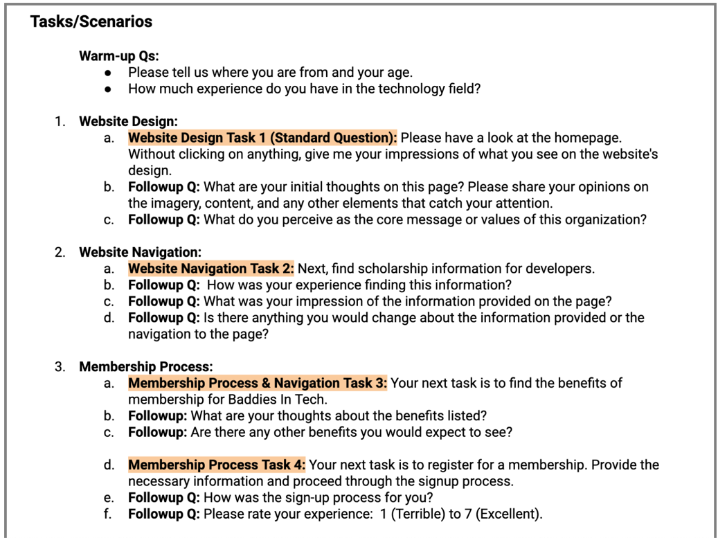
Usability testing plan the warm-up, tasks, and follow-ups I wrote for the moderated sessions.
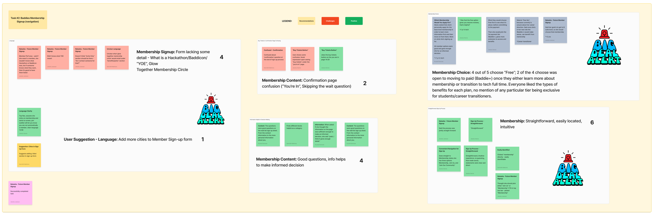
Affinity map session notes clustered into themes and rated by impact. Built with the research team.
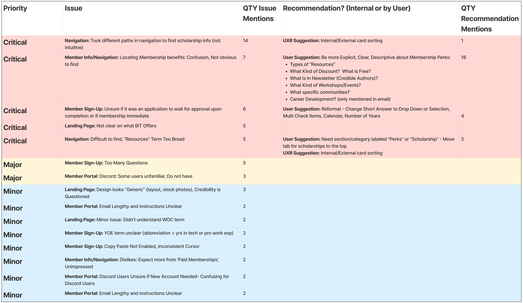
Prioritized findings matrix every issue by priority, issue mentions, and user or UXR recommendation. Team synthesis I contributed to.
Synthesis · Findings
I centralized every observation, built the affinity map with the team, and prioritized issues based on both severity and frequency. Five critical friction points rose to the top.
Members took different paths and couldn't locate scholarship information intuitively.
Run internal and external card sorting, and surface scholarships far more clearly in the nav.
UX researchBenefits were confusing and hard to locate.
Spell out what's free, what's discounted, what's in the newsletter, and which workshops and communities are included. Members suggested this 18 times, counted separately from the 7 issue mentions.
MembersUsers couldn't tell whether sign-up meant immediate membership or an application awaiting approval.
Clarify what submitting actually does, and simplify field formats with dropdowns, multi-select, and a calendar instead of short-answer fields.
MembersVisitors couldn't tell what BIT actually offered on first arrival.
Lead with a plain statement of what BIT offers and who it's for, above the fold.
UX research“Resources” was too broad to predict what sat underneath it.
Use clearer labels such as “Perks” or “Scholarships,” and surface those destinations prominently.
MembersThe form asked too many questions for a first interaction.
Cut to essential fields and defer the rest to the member profile.
UX researchThe Discord-based portal tripped up members unfamiliar with Discord.
Orient new members with a short primer, or offer a non-Discord path into the community.
MembersGeneric-looking design, unexplained jargon (“WOC,” “YOE”), disabled copy-paste, and lengthy portal emails.
Handed to the design and writing teams as a backlog rather than redesign drivers.
MixedIn members' words
“Be more explicit about the perks, what's free, what's discounted, what's in the newsletter, what workshops and communities do I actually get?”
Membership benefits · 18 recommendation mentions
“Give scholarships their own label and move them to the top, ‘Resources' hides too much.”
Navigation
“Reformat the sign-up, swap the short-answer fields for dropdowns, multi-select, and a calendar.”
Member sign-up · reformat request
“Run a card sort to settle the navigation, internal opinions were all over the place.”
My UXR recommendation
Card sorting
The navigation findings, and genuine disagreement inside the team about what to call things, made the case for a card sort. I helped run the activity: we first drafted our own category structure, finalized the cards, then invited other project members to sort the revised set.
Our research lead analyzed the results, and I helped surface the patterns into clear IA recommendations.
Information architecture & handoff
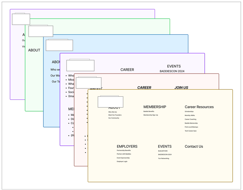
Card sort categories each team member's proposed groupings. I took part; our research lead analyzed the results.
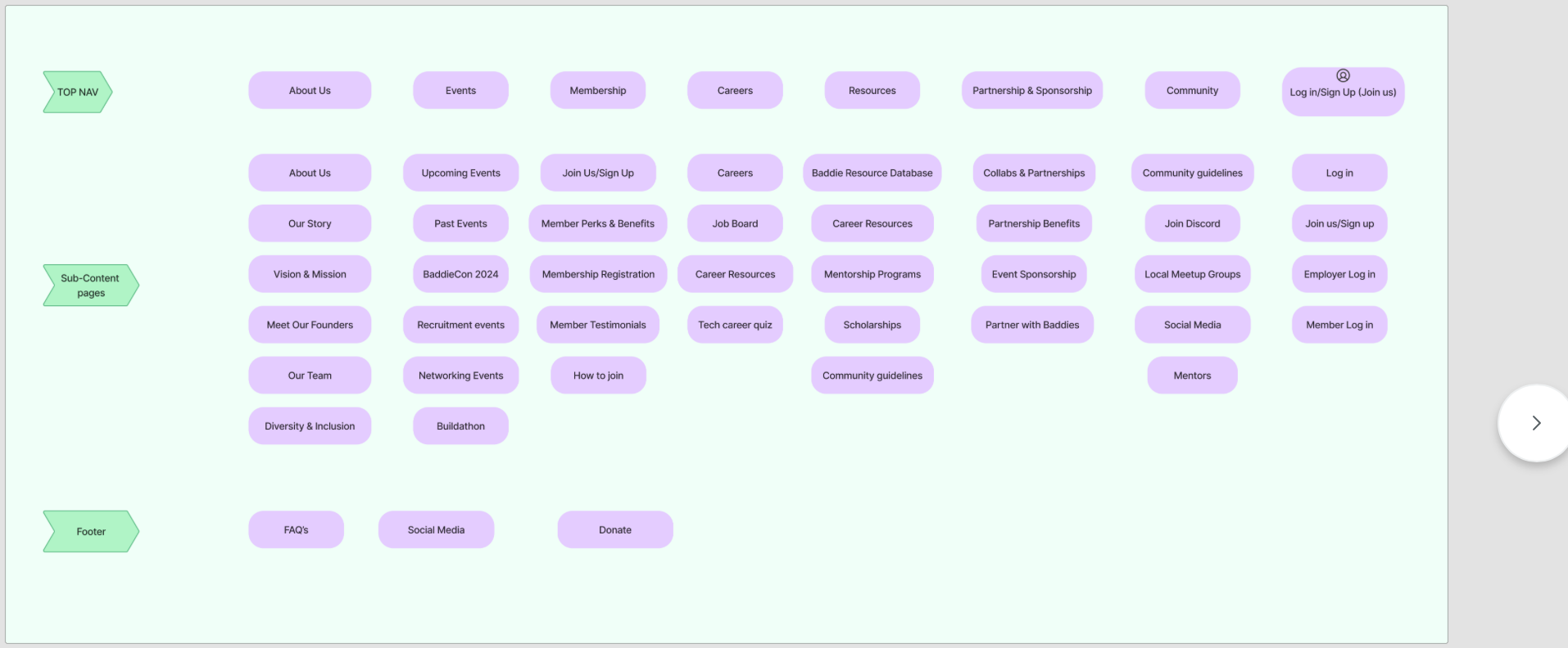
Proposed information architecture the navigation the card-sort patterns pointed to. A team output I helped turn into recommendations.
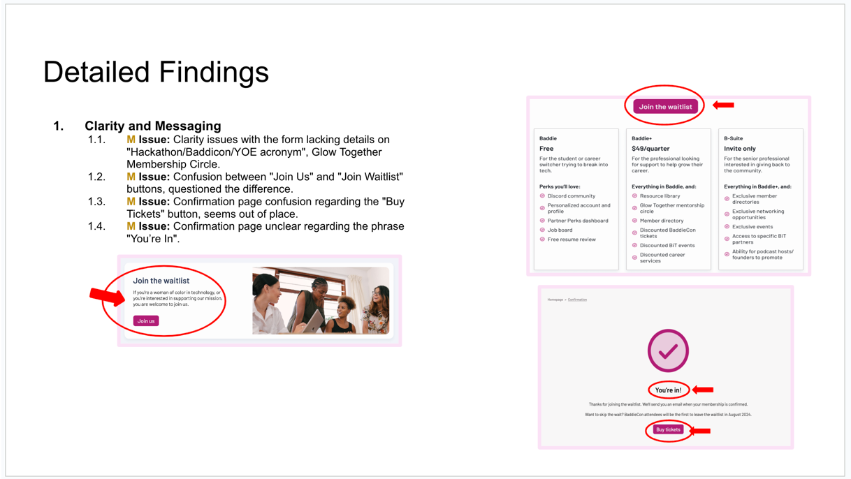
Client report, detailed findings annotated issues delivered at handoff. A team deliverable; I edited copy and images.
Streamline overlapping labels, fold “Join Us” and “Membership Registration” together under a single, clear “Membership.”
Structure the menu around the categories members actually grouped, so they find information quickly.
Give the most-mentioned categories, About Us, Events, Membership, Careers, prominence on the homepage and nav bar.
Emphasize community-building spaces like Join Discord and local meetup groups to foster real belonging.
Accessibility audit
I contributed to an accessibility review so the redesign would work for members with a range of abilities, not just the “average” user we'd imagined.
Color contrast, text legibility, and clear focus states for low-vision and color-blind members.
Captions and transcripts for any video or audio so deaf and hard-of-hearing members aren't left out.
Labeled fields, clear error messages, and inputs that don't fight assistive tech during sign-up.
Logical heading order and keyboard navigability so the IA works without a mouse.
Recommendations & handoff
I helped centralize the data and generate the top recommendations, which we delivered to the design and writing teams and presented to the client.
Rather than dictating every fix, we paired ranked findings with member quotes, giving the writing and design teams the why behind each one and the autonomy to solve it well. The benchmark also gave us a baseline to measure future redesigns against.
Every issue rated by impact and frequency, so the team knew exactly where to start.
A navigation structure grounded in the card sort instead of internal opinion.
A baseline of the current experience to measure every future redesign against.
The engagement ended at handoff, so what's above are the research deliverables and the benchmark, not measured post-redesign outcomes.
Reflection
I asked a lot of questions to pressure-test the tasks and plan I'd written, and the adjustments that came back made the study stronger. Inviting other people's questions surfaced insights I'd have missed alone.
I reached out to the writing and design leads directly to make sure we addressed their concerns. Those working relationships outlasted the project, we still talk.
A technical hiccup kept us from fully exporting the card-sort results in time, a real limit on how confidently we could recommend the new IA. Next round I'd resolve it early and close that loop.
Retest scholarship and membership findability against the new labels, and check whether the reformatted sign-up makes the outcome clear, measured against this benchmark. I'm staying connected to BIT's progress because I believe in the mission.